On this page
Match page geometry to the intended use
A4 and Letter work well for ordinary documents and office printing. A5 produces a compact book-like page. Landscape orientation is useful for unusually wide illustrations or tables but is rarely ideal for narrative reading.
| Profile | Best for | Watch for |
|---|---|---|
| A4 or Letter | Office printing and review | More words per page |
| A5 portrait | Book-like reading copies | More pages and image scaling |
| Landscape | Wide visual content | Long text lines |
Control type size, measure and spacing together
Larger text improves legibility but creates more pages. Wider margins shorten line length, and generous line spacing helps dense text breathe. These settings should be evaluated as one reading profile.
Book serif suits narrative prose, modern sans serif works well for manuals, and the accessible profile prioritizes familiar high-legibility shapes.
Choose chapter and reader features deliberately
Starting each chapter on a new page produces clear navigation and print structure. Continuous flow saves pages. A linked contents page, page numbers and a quiet running title help readers navigate a fixed document.
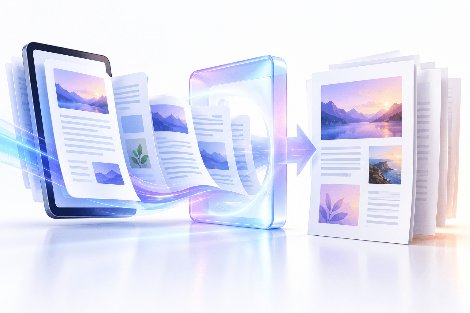
Keep images for illustrated books, but inspect complex full-bleed artwork and fixed-layout publications because reflow conversion changes their composition.
Put the workflow into practice
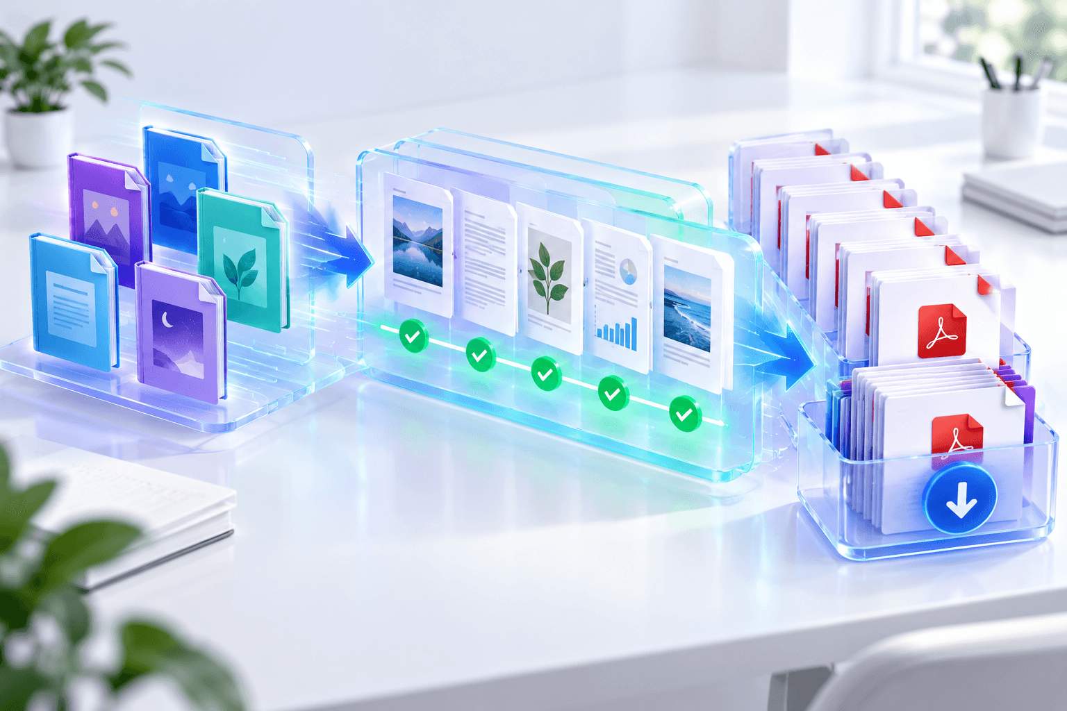
Add one EPUB or a batch, choose the fixed-page reading profile, render chapters in spine order, then preview every completed PDF before download.
Try EPUB to PDFFrequently asked questions
Clear answers before you merge
Which page size is best for ebooks?
A5 feels book-like; A4 or Letter is often better for office review and printing.
Can font size be changed?
Yes. Select 9–18 point text and a controlled line-spacing value.
Can images be omitted?
Yes. Disable supported ebook images for a text-focused edition.